Tableau Visualizations of the “Great Recession” (2007-2009)

Executive Summary

The Great Recession was one of the most turbulent economic periods of the past eighty years.  It was a global economic recession that impacted hundreds of banks, some of them responsible for financing the Gross Domestic Product (GDP) of entire countries. During the recession, many banks closed due to the speculation that flooded into the real estate market with new banking products that gave loans to millions of subprime consumers.  This allowed people to take out loans with low interest rates but very complicated terms that made it much easier to end up in foreclosure proceedings. During this period, home mortgages defaults skyrocketed in many states further depressing the market. This in turned caused many people to lose their life savings as well as their home and jobs. It is now popularly considered the longest period of economic downturn since the Great Depression of the 1930’s.

Since the great recession, many financial regulations and policies were put in place to prevent it from happening in the future.  The most popular of these were the Dodd-Frank Wall Street Reform and Consumer Protection act, also known as part of the Emergency Economic Stabilization Act, passed by Congress that amended many existing regulations to make it much easier to protect consumers by creating new government agents tasked with overseeing aspects of the financial banking system.  When Donald Trump was elected President in 2016, he signed a new law rolling back significant portions of the law.

One of the upsides of the recession is how much articles, books, and analysis done before, during and after the financial crisis.  This is of significant importance, because understanding how the financial markets got to that point in 2008, will help consumers better understand and better prepare for what not to do.  Another added benefit of understanding this period of time, is how many banks gambled with risky financial products, only to lose all the money it had.  Many consumers are now educated enough to know take on these risky loans, and banks scrutinized mortgage applications more closely.  During the recession, Inflation in the market ballooned housing prices until there was an inevitable crash.

The following report details state-by-state the impact of this period on the housing market, consumers, and overall housing values to give the audience a better understanding of quantitative impact monthly and yearly.  I will also show visualizations of housing prices detailing the loss of housing value, as a result causing many borrowers to be “under water” with their home mortgages.  The report will also focus on four states (North Carolina, California, Massachusetts and Florida) and impact on job losses and employment each month during the period of this recession.

Charts and Graphs

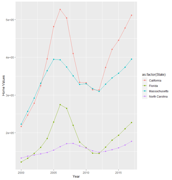
One the most crippling results of the Great Recession was on consumers.  Many consumers lost their homes as the downturn rippled throughout the country.  Figure 1 shows an aggregate picture of housing prices between 1996 and 2017 for the four states analyzed.  Notice how there was a steep growth in housing values and then a sudden drop during the period during and shortly after the recession.  Housing values would eventually rise again, but trillions of dollars of equity would be lost, with many communities not recovering.

Figure (1):  Average condo home prices in Florida and California were impacted more heavily by the economic downturn and drop in housing prices compared to North Carolina and Massachusetts.  Source Zillow.com

The impact of housing prices for California and Florida do not really come as a surprise.  Both of these states tend to have housing values greater than states where the cost of living is less.  Also, these states tend to have residents with higher incomes than the general population (retirees and white-collar workers).

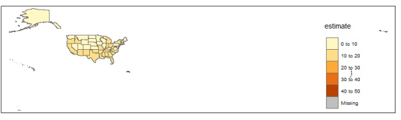
When compared to the entire country, several states saw changes in the percentage of income compared to the change in home ownership.  This is an indication of how well some states weathered the economic downturn among their populations.  States such as California, Nevada, and many areas in the southwest saw a slow precipitous drop in home ownership along with a drop in income (with the exception of Utah).  Many states in the south did see drops in home ownership, but on average, the incomes of their populations remained the same.  North Carolina, for instance, saw no net loss of income, but an increase in home ownership.  States such as Nevada saw both large losses in income for their population as well as loss in home ownership in Figure 2.  Nevada was particularly hit hard by the economic recession.

Figure (2):  A heat map of the country comparing changes in income and home ownership.  Source GeoFred. https://geofred.stlouisfed.org/

The nest visualization shows the average unemployment rate.  This increased significantly during and after the great recession.  In figure 3, it shows how this unemployment became more long than the period of the recession itself, showing the economic impact on families beyond the initial wave of economic decline.

Figure (3):  Line graph of unemployment rates. Source U.S. Bureau of Labor Statistics.  https://www.bls.gov/cps/tables.htm

Conclusion

What these graphs show us is how, during the economic downturn, there was not only an impact on the housing market, but also income growth and unemployment.  Showing the scope and depth of the problem.  One of the unfortunate results of the recession was that many banks considered “too big to fail” received government funding to bail them out, and many homeowners and consumers were left to fill the blunt of the economic recession on their own.

Comparing Machine Learning Models in Determining Credit Worthiness for Bank Loans

The R language has a number of machine learning libraries to help determine for both supervised and unsupervised machine learning. This includes such ML techniques such as linear and logistic regression, decision trees, random forest, generalized boosted regression modeling among others. I strongly recommend learning how these models work and how they can be used to predictive analytics.

Part of the Machine Learning process includes the following:

  1. Sample: Create a sample set of data either through random sampling or top tier sampling.  Create a test, training and validation set of data.
  2. Explore: Use exploratory methods on the data.  This includes descriptive statistics, scatter plots, histograms, etc.
  3. Modify:  Clean, prepare, impute or filter data.  Perform cluster analysis, association and segmentation.
  4. Model:  Model the data using Logistic or Linear regression, Neural Networking, and Decision Trees.
  5. Assess:  Access the model by comparing it to other model types and again real data. Determine how close your model is to reality.  Test the data using hypothesis testing.

When creating machine learning models for any application, it is wise to following a process flow such as the following:

In the following example, we use machine learning to determine the credit worthiness of prospective borrowers for a bank loan.

The loan data consist of the following inputs

  1. Loan amount
  2. Interest rate
  3. Grade of credit
  4. Employment length of borrower
  5. Home ownership status
  6. Annual Income
  7. Age of borrower

The response variable or predictor to predict the default rate

  1. Loan status (0 or 1).

After loading the data into R, we partition the data for training or testing sets.

loan <- read.csv("loan.csv", stringsAsFactors = TRUE)

str(loan)

## Split the data into 70% training and 30% test datasets

library(rsample)
set.seed(634)

loan_split <- initial_split(loan, prop = 0.7)

loan_training <- training(loan_split)
loan_test <- testing(loan_split)

Create a over-sample training data based on ROSE library. This checks for over-sampling of the data.

str(loan_training)

table(loan_training$loan_status)

library(ROSE)

loan_training_both <- ovun.sample(loan_status ~ ., data = loan_training, method = "both", p = 0.5)$data

table(loan_training_both$loan_status)

Build a logistic regression model and a classification tree to predict loan default.

loan_logistic <- glm(loan_status ~ . , data = loan_training_both, family = "binomial")

library(rpart)

loan_ctree <- rpart(loan_status ~ . , data = loan_training_both, method = "class")

library(rpart.plot)

rpart.plot(loan_ctree, cex=1)

Build the ensemble models (random forest, gradient boosting) to predict loan default.

library(randomForest)

loan_rf <- randomForest(as.factor(loan_status) ~ ., data = loan_training_both, ntree = 200, importance=TRUE)

plot(loan_rf)

varImpPlot(loan_rf)

library(gbm)

Summarize gradient boosting model

loan_gbm <- gbm(loan_status ~ ., data = loan_training_both, n.trees = 200, distribution = "bernoulli")
summary(loan_gbm)

Use the ROC (receiver operating curve) and compute the AUC (area under the curve) to check the specificity and sensitivity of the models.

# Step 1. Predicting on test data

predicted_logistic <- loan_logistic %>% 
  predict(newdata = loan_test, type = "response")

predicted_ctree <- loan_ctree %>% 
  predict(newdata = loan_test, type = "prob")

predicted_rf <- loan_rf %>% 
  predict(newdata = loan_test, type = "prob")

predicted_gbm <- loan_gbm %>% 
  predict(newdata = loan_test, type = "response")

# Step 3. Create ROC and Compute AUC

library(cutpointr)

roc_logistic <- roc(loan_test, x= .fitted_logistic, class = loan_status, pos_class = 1 , neg_class = 0)
roc_ctree<- roc(loan_test, x= .fitted_ctree, class = loan_status, pos_class = 1 , neg_class = 0)
roc_rf<- roc(loan_test, x= .fitted_rf, class = loan_status, pos_class = 1 , neg_class = 0)
roc_gbm<- roc(loan_test, x= .fitted_gbm, class = loan_status, pos_class = 1 , neg_class = 0)

plot(roc_logistic) + 
  geom_line(data = roc_logistic, color = "red") + 
  geom_line(data = roc_ctree, color = "blue") + 
  geom_line(data = roc_rf, color = "green") + 
  geom_line(data = roc_gbm, color = "black")

auc(roc_logistic)
auc(roc_ctree)
auc(roc_rf)
auc(roc_gbm)

These help you compare and score which model works best for the type of data presented in the test set. When looking at the ROC chart, you can see that the gradient boost model has the best performance of all the model as it is closer to 1.00 than the other models. Classifiers that are closer to 1.00 for the top left where Sensitivity is 1.00 and Specificity is closer to 0.00 have the best performance.

Storytelling with R Markdown, Storyboards and Knitr

Storytelling with data is a critical aspect of data visualization. The ability to bring massive amounts of data and simplify it to an audience creatively and with meaning in purpose is a skill that is critical to data science. With the plethora of tools available to create effective story telling (Tableau, PowerBI, Data Driven Documents (D3), etc.) there are a few others that don’t get mentioned.

One of my favorites tools to use is R Markdown, storyboards and Knitr. R Markdown is a simple formatting syntax for authoring HTML, PDF, and MS Word documents using already existing R code (for more information go to http://rmarkdown.rstudio.com).

When you create a markdown document with extension *.rmd, you are given a button called Knit. Once clicked a document will be generated that includes both content and output of any embedded R code chunks within the document.

In this example, we take R Markdown syntax with R code for the MotorTrends car library to demonstrate how this works:

---
title: " Markdown 2"
author: "Derek Moore"
date: "3/22/2021"
output: html_document
---

```{r setup, include=FALSE}
knitr::opts_chunk$set(echo = TRUE)
```

## R Markdown


```{r cars}
summary(cars)
```

## Including Plots

You can also embed plots, for example:

```{r pressure, echo=FALSE}
plot(pressure)

```

The Knit button is located in the top left hand corner of the R toolbox.

When pressed, the Knitr package creates either a PDF, Rich document or HTML, based on your settings. In my case, it’s an HTML file

Finally, a storyboard is a great storytelling tool that can be created by R Markdown. By implementing storyboarding within the syntax, you can create dynamic storyboards within HTML.

---
title: "2008 Recession"
author: "Derek Moore"
output: 
  flexdashboard::flex_dashboard:
      storyboard: true
      theme: bootstrap
      orientation: rows
 
---

```{r setup, include = FALSE, echo=FALSE}
library(ggplot2)
library(dplyr)
library(readr)
library(DT)
library(flexdashboard)
library(tidyverse)
library(datasets)
library(ggplot2)
library(grid)
#library(png)
#library(imager)
#library(plyr)
#install.packages("tidycensus")
#library(tidycensus)
#install.packages("tmap")
#library(tmap)
#library(tmaptools)
#library(sf)
#install.packages("imager")
#library(imager)

knitr::opts_chunk$set(fig.width = 5, fig.asp = 1/3)

setwd("C:/Dev/ISM 646/Assignment2/")
load(file = "Assignment2_646.RData")

```

<font face="sans-serif" size="1" color="#000000">Percentage of Subprime borrowers<br>during the Great Recession (2005 to 2009) </font> 
====================================================================

Row {data-width=100}
------------------------------------------------------------------

### <br><br><br><br><br> <font face="sans-serif" size="4" color="#000000"> The Great Recssion was one of the most turbulent economic periods of the past eighty year that lasted from December of 2007 and ended June of 2009.  It was a global economic recession that impacted hundreds of banks, some responsible for the financing of the Gross Domestic Product (GDP) of entire countries.  During this period, many banks closed.  Thousands lost jobs and fell into poverty due to the collapsing economy, which was basically fulled by rising federal interest rates and  market speculation centered around mortgage back securities that failed due to consumer defaulting on their mortgage.  This sent housing prices eventually plumetting, causing more economic turmoil in local economies around the world. As banks failed, businesses and consumers lost money.  In the U.S., the Great Recession ended with a GDP decline of 4.3 percent and an unemployment rate of 10 percent. </font><br><br> <font face="sans-serif" size="4" color="#000000">  The largest crisis of the Great Receession were subprime mortgages. Hedge funds, insurance companies, banks and other financial institutions created or insured mortgage-backed securities, all in an attempt make more money from the creation of default swaps (CDS) which tended to have higher rates of return.  In addition to this, the Federal Reserve raised rates. Adjustable-Rate Mortgages or ARMs and Interest Only (IO) loans, were being combined within the CDSs to give them high investor ratings, as to appear safe. This created a huge incentive for banks to approve subprime or low-credit, high-risk borrowers.  Derivatives spread the risk globally causing the 2007 banking crisis and the the Great Recession. </font>


Row {.tabset .tabset-fade}
--------------------------------------------------------------------

### % Subprime Borrowers in North Carolina (2005-2010)

```{r Subprime Borrowers in North Carolina}

ChartA <- ggplot(Subprime_NC, aes(x = `Year-Quarter`, y = Percent, color=`Percent`)) + 
  geom_point(size=3) + 
  geom_smooth(method="lm", se=FALSE) +
  ylab("% Receiving Subprime Loans (NC)") +
   theme(axis.text.x = element_text(angle = 90, vjust = 0.5, hjust=1 ,size = 8), axis.title.y=element_text(size=5)) +
    scale_x_discrete(limit = c("2005 Q1","2005 Q2","2005 Q3","2005 Q4","2006 Q1","2006 Q2","2006 Q3","2006 Q4","2007 Q1","2007 Q2","2007 Q3","2007 Q4","2008 Q1","2008 Q2","2008 Q3","2008 Q5","2009 Q1","2009 Q2","2009 Q3","2009 Q4","2010 Q1"))


plot(ChartA)

```


### % subprime Borrower in Massachusetts (2005-2010)


```{r Subprime Borrowers in Massachusetts}

ChartA <- ggplot(Subprime_MA, aes(x = `Year-Quarter`, y = Percent, color=`Percent`)) + 
  geom_point(size=3) + 
  geom_smooth(method="lm", se=FALSE) +
  ylab("% Receiving Subprime Loans (MA)") +
   theme(axis.text.x = element_text(angle = 90, vjust = 0.5, hjust=1 ,size = 8), axis.title.y=element_text(size=5)) +
  scale_x_discrete(limit = c("2005 Q1","2005 Q2","2005 Q3","2005 Q4","2006 Q1","2006 Q2","2006 Q3","2006 Q4","2007 Q1","2007 Q2","2007 Q3","2007 Q4","2008 Q1","2008 Q2","2008 Q3","2008 Q5","2009 Q1","2009 Q2","2009 Q3","2009 Q4","2010 Q1"))

plot(ChartA)

```


### % subprime Borrowers in Florida (2005-2010)


```{r Subprime Borrowers in California}

ChartA <- ggplot(Subprime_CA, aes(x = `Year-Quarter`, y = Percent, color=`Percent`)) + 
  geom_point(size=3) + 
  geom_smooth(method="lm", se=FALSE) +
  ylab("% Receiving Subprime Loans (CA)") +
   theme(axis.text.x = element_text(angle = 90, vjust = 0.5, hjust=1 ,size = 8), axis.title.y=element_text(size=5)) +
  scale_x_discrete(limit = c("2005 Q1","2005 Q2","2005 Q3","2005 Q4","2006 Q1","2006 Q2","2006 Q3","2006 Q4","2007 Q1","2007 Q2","2007 Q3","2007 Q4","2008 Q1","2008 Q2","2008 Q3","2008 Q5","2009 Q1","2009 Q2","2009 Q3","2009 Q4","2010 Q1"))

plot(ChartA)


```


### % subprime Borrowers in California (2005-2010)


```{r Subprime Borrowers in Florida}

ChartA <- ggplot(Subprime_FL, aes(x = `Year-Quarter`, y = Percent, color=`Percent`)) + 
  geom_point(size=3) + 
  ylab("% Receiving Subprime Loans (FL)") +
   theme(axis.text.x = element_text(angle = 90, vjust = 0.5, hjust=1 ,size = 8), axis.title.y=element_text(size=5)) +
  scale_x_discrete(limit = c("2005 Q1","2005 Q2","2005 Q3","2005 Q4","2006 Q1","2006 Q2","2006 Q3","2006 Q4","2007 Q1","2007 Q2","2007 Q3","2007 Q4","2008 Q1","2008 Q2","2008 Q3","2008 Q5","2009 Q1","2009 Q2","2009 Q3","2009 Q4","2010 Q1"))

plot(ChartA)


```

Creating Twitter Sentiment Association Analysis using the Association Rules and Recommender System Methods

Contextual text mining methods extract information from documents, live data streams and social media.  In this project, thousands of tweets by users were extracted to generate  sentiment analysis scores.

Sentiment analysis is a common text classification tool that analyzes streams of text data in order to ascertain the sentiment (subject context) of the text, which is typically classified as positive, negative or neutral. 

In the R sentiment analysis engine, our team built, the sentiment score has a range of .-5 to 5. Numbers within this range determine the the change in sentiment. 

SentimentScore
Negative-5
Neutral0
Positive5

Sentiment Scores are determined by a text file of key words and scores called the AFINN lexicon.  It’s a popular with simple lexicon used in sentiment analysis.  

New versions of the file are released in source repositories and contains over 3,300+ words with scores associated with each word based on its level of positivity or negativity.

Twitter is an excellent example of sentiment analysis.

An example of exploration of the sentiment scores based on the retweets filtered on the keywords:

  1. Trump
  2. Biden
  3. Republican
  4. Democrat
  5. Election

The data was created using a sentiment engine built in R.  It is mostly based on the political climate in the United States leading up to and after the 2020 United States election.

Each bubble size represents the followers of user who’ve retweeted.  The bubble size gives a sense of the influence of those users (impact). The Y-axis is the sentiment score, the X-axis represents the retweet count of the bubble name.

“Impact” is a measure of how often a twitter user is retweeted by users with high follower counts.

Using the Apriori Algorithm, you can build a sentiment association analysis in R. See my article on Apriori Association Analysis in R.

Applying the Apriori algorithm. using the single format, we assigned our transactions as the sentiment score and We assigned items_id as retweeted_screen_name.  

This is the measure the association between highly retweeted accounts and their associations based on sentiment scores (negative, neutral, positive).  Support is the minimum support for an itemset.  Minimum support was set to 0.02.

The majority of the high retweeted accounts had highly confident associations based on sentiment values. We then focused on the highest confidence associates that provided lift above 1.  After removing redundancy, we were able to see the accounts where sentiment values are strongly associated between accounts.

 According to the scatter plot above, we see most of the rules overlap, but have very good lift due to strong associations, but also this is indicated by the limited number of transactions and redundancy in the rules.

The analysis showed a large number of redundancy, but this was mostly due to the near nominal level of sentiment values.  So having high lift, a larger minimum support and .removing redundancy find the most valuable rules.

Apriori Association Analysis using R

install.packages("tidyverse")
library(tidyverse)

# install.packages("arules")
library(arules)
# install.packages("arulesViz")
library(arulesViz)

# prepare for transaction data

my_basket1 <- read.transactions("GroceryStore_Basket.csv", format="basket", sep=",")

my_sentiment <- 

my_basket1

inspect(my_basket1)

my_basket2 <- read.transactions("GroceryStore_Single.csv", format="single", sep=",", cols = c("TransactionID","Item"), header= TRUE)

inspect(my_basket2)

## (1) Import "Online Retail.csv" as a transaction data

summary(my_basket2)

itemFrequencyPlot(my_basket2)

rules <- apriori(my_basket2, parameter = list(supp=0.01, conf=0.8, maxlen =4))

summary(rules)
inspect(rules)

rules <- sort(rules, by = 'confidence', decreasing = TRUE)
inspect(rules[1:10])

itemFrequencyPlot(my_basket2)
## (2) Summarize and visualize transaction data 

rules <- apriori(my_basket2, parameter=list(supp=0.01, conf=0.8, maxlen=4, minlen=2))

summary(rules)
inspect(rules)

rules <- sort(rules, by = "confidence")

## (3) Apply the Apriori algorithm

## Remove redundant rules

is.redundant(rules)

inspect(rules[is.redundant(rules)])

rule2 <- rules[!is.redundant(rules)]
inspect(rules2)

plot(rules2)
plot(rules2, method = "graph")
plot(rules[1:10], method = "graph")


bread_rules <- apriori(my_basket2, parameter = list(supp=0.01, conf=0.8, maxlen=4), appearance=list(default="lhs", rhs = "BREAD"))

bread_rules <- sort(bread_rules, by = "confidence", decreasing = TRUE)
inspect(bread_rules)
plot(bread_rules, method="graph")

Using the American Community Survey API in R

The United Status Census Bureau is one of the largest data collection and aggregation organizations in the United States. Their Survey and collection processes allow district lines to be drawn for voting, help local, state and municipal organizations determine how to allocate budgets, and give non-profit organizations insight into the the changing demographics of the United States. Among this incredibly valuable dataset is the American Community Survey or ACS, that collects data on race, gender, household income, employment, education, and age of citizens within each U.S. State. The ACS API or Application Program Interface is a valuable tool to collect and visualize the ACS data, without having to store it locally. The API allows you to interface with the U.S. Census Bureau portal to load the data directory into the R.

First I load I the libraries and packages necessary.

library(tidyverse)
library(tidyr)
library(ggplot2)
library(dplyr)
install.packages("broom")
library(readxl)
install.packages("stringi")
library(stringi)
install.packages("tidycensus")
library(tidycensus)
install.packages("tmap")
library(tmap)
library(tmaptools)
library(sf)
library(png)
install.packages("imager")
library(imager)

To get the load data from the ACS API. You have to apply for a U.S. Census Key. To find out more information on using the U.S. Census API go to Census API User’s Guide.

census_api_key('<api_key>', install=TRUE, overwrite=TRUE)

Use the get_acs to pull the data into R.

ACS_2010 <- get_acs("state",  year=2010, variables="S1702_C02_001", output="tidy", geometry=TRUE) %>%
  select(-moe)

ACS_2011 <- get_acs("state", variables="S1702_C02_001", year=2011, output="tidy", geometry=TRUE) %>%
  select(-moe)

ACS_2012 <- get_acs("state", variables="S1702_C02_001", year=2012, output="tidy", geometry=TRUE) %>%
  select(-moe)
  
ACS_2013 <- get_acs("state", variables="S1702_C02_001", year=2013, output="tidy", geometry=TRUE) %>%
  select(-moe)

ACS_2014 <- get_acs("state", variables="S1702_C02_001", year=2014, output="tidy", geometry=TRUE) %>%
  select(-moe)

ACS_2015 <- get_acs("state", variables="S1702_C02_001", year=2015, output="tidy", geometry=TRUE) %>%
  select(-moe)

ACS_2016 <- get_acs("state", variables="S1702_C02_001", year=2016, output="tidy", geometry=TRUE) %>%
  select(-moe)

ACS_2017 <- get_acs("state", variables="S1702_C02_001", year=2017, output="tidy", geometry=TRUE) %>%
  select(-moe)

The variable S1702_C02_001 is the table ID for the category of data that will be loaded. The data represents housing income data. Use Tidyverse to organize and aggregate.

ACS_geo_2011 <- ACS_2011 %>%
  select('GEOID','NAME','variable','estimate','geometry') %>%
  filter(variable=='S1702_C02_001') %>%
  group_by(GEOID, NAME) %>%
  summarize(estimate = sum(estimate)) 

ACS_geo_2012 <- ACS_2012 %>%
  select('GEOID','NAME','variable','estimate','geometry') %>%
  filter(variable=='S1702_C02_001') %>%
  group_by(GEOID, NAME) %>%
  summarize(estimate = sum(estimate)) 

ACS_geo_2013 <- ACS_2013 %>%
  select('GEOID','NAME','variable','estimate','geometry') %>%
  filter(variable=='S1702_C02_001') %>%
  group_by(GEOID, NAME) %>%
  summarize(estimate = sum(estimate)) 

ACS_geo_2014 <- ACS_2014 %>%
  select('GEOID','NAME','variable','estimate','geometry') %>%
  filter(variable=='S1702_C02_001') %>%
  group_by(GEOID, NAME) %>%
  summarize(estimate = sum(estimate)) 

ACS_geo_2015 <- ACS_2015 %>%
  select('GEOID','NAME','variable','estimate','geometry') %>%
  filter(variable=='S1702_C02_001') %>%
  group_by(GEOID, NAME) %>%
  summarize(estimate = sum(estimate)) 

ACS_geo_2016 <- ACS_2016 %>%
  select('GEOID','NAME','variable','estimate','geometry') %>%
  filter(variable=='S1702_C02_001') %>%
  group_by(GEOID, NAME) %>%
  summarize(estimate = sum(estimate))

ACS_geo_2017 <- ACS_2017 %>%
  select('GEOID','NAME','variable','estimate','geometry') %>%
  filter(variable=='S1702_C02_001') %>%
  group_by(GEOID, NAME) %>%
  summarize(estimate = sum(estimate))

To generate the vector maps of the ACS, use tmap calls.

jpeg(file="ACS_geo_2010.jpg")
tm_shape(ACS_geo_2010) + tm_polygons("estimate") + tm_layout(title.position=c("left","top"), title="Poverty Levels in U.S. Post-Recessions", asp=1)
dev.off()

plot(load.image("ACS_geo_2010.jpg"), axes=FALSE)


tm_shape(ACS_geo_2011) + tm_polygons("estimate")

tm_shape(ACS_geo_2012) + tm_polygons("estimate")

tm_shape(ACS_geo_2013) + tm_polygons("estimate")

tm_shape(ACS_geo_2014) + tm_polygons("estimate")

tm_shape(ACS_geo_2015) + tm_polygons("estimate")

tm_shape(ACS_geo_2016) + tm_polygons("estimate")

tm_shape(ACS_geo_2017) + tm_polygons("estimate")

Data from the ACS portal can also be used to compare the home values by year of certain states.


ACS_Data_Housing <- ACS_Data %>%
  select('Home Values','Household Income','Bankruptcies','Percent Homeownership','Percent People in Poverty','State','Year') %>%
  filter(State %in% c("North Carolina","Massachusetts","Florida","California")) %>%
  group_by(`Year`)

ggplot(data=ACS_Data_Housing, aes(x=Year, y=`Home Values`, group=as.factor(`State`), color=as.factor(`State`))) +
   geom_line() + geom_point() +
  ylab("Home Values") +
  labs("States")

Using R to Create Decision Tree Classification

R is a great language for creating decision tree classification for a wide array of applications. Decision trees are a tree-like model in machine learning commonly used in decision analysis. The technique is commonly used in creating strategies for reaching a particular goal based on multi-dimensional datasets.

Decision trees are commonly used for applications such as determining what type of consumer is at higher risk of defaulting on a loan than borrowers of lower risk. What sort of factors impacts whether a company can retain customers, and what type of students are more at risk at dropping out and require mediation based on school attendance, grades, family structure, etc.

Below are the typically libraries for building machine learning analysis are below including decision trees, linear and logistic regression

library(tidyverse)
library(dplyr)
library(broom)
library(yardstick)
library(DescTools)
library(margins)
library(cutpointr)
library(tidyverse)
library(caTools)
library(rsample)
library(ROSE)
library(rpart)
library(rpart.plot)
library(caret)
install.packages("rsample")
install.packages("caTools")
install.packages("ROSE")
install.packages("rpart")
install.packages("rpart.plot")
install.packages("yardstick")
install.packages("DescTools")
install.packages("margins")
install.packages("cutpointr")

The following code block creates regression and decision tree analysis of custom churn predictions.

# Import the customer_churn.csv and explore it.
# Drop all observations with NAs (missing values)


customers <- read.csv('customer_churn.csv')
summary(customers)
str(customers)
customers$customerID <- NULL
customers$tenure <- NULL
sapply(customers, function(x) sum(is.na(x)))
customers <- customers[complete.cases(customers),]


#===================================================================


#  Build a logistic regression model to predict customer churn by using predictor variables (You determine which ones will be included).
# Calculate the Pseudo R2 for the logistic regression.


# Build a logistic regression model to predict customer churn by using predictor variables (You determine which ones will be included).

customers <- customers %>%
 mutate(Churn=if_else(Churn=="No", 0, 1))


str(customers)
         
regression1 <- glm(Churn ~ Contract + MonthlyCharges + TotalCharges + TechSupport + MultipleLines + InternetService, data=customers, family="binomial")


# Calculate the Pseudo R2 for the logistic regression.


regression1 %>%
  PseudoR2()

#  Split data into 70% train and 30% test datasets.
#  Train the same logistic regression on only "train" data.

#  Split data into 70% train and 30% test datasets.


set.seed(645)

customer_split <- initial_split(customers, prop=0.7)
train_customers <- training(customer_split)
test_customers <- testing(customer_split)

# Train the same logistic regression on only "train" data.

regression_train <- glm(Churn ~ Contract + MonthlyCharges + TotalCharges + TechSupport + MultipleLines + InternetService, data=train_customers, family="binomial")
#regression_test <- glm(Churn ~ Contract + MonthlyCharges + TotalCharges + tenure + TechSupport, data=test_customers)


#  For "test" data, make prediction using the logistic regression trained in Question 2.
#  With the cutoff of 0.5, predict a binary classification ("Yes" or "No") based on the cutoff value, 
#  Create a confusion matrix using the prediction result.

#. For "test" data, make prediction using the logistic regression trained in Question 2.

str(regression_train)
prediction <- regression_train %>%
  predict(newdata = test_customers, type = "response")


# With the cutoff of 0.5, predict a binary classification ("Yes" or "No") based on the cutoff value, 


#train_customers <- train_customers %>%
#  mutate(Churn=if_else(Churn=="0", "No", "Yes"))


The last code creates the decision tree.


train_cust_dtree <- rpart(Churn ~ ., data=train_customers, method = "class")
rpart.plot(train_cust_dtree, cex=0.8)

Check the sensitivity and specificity of the classification tree, we create a confusion matrix for ROC charts. ROC Charts are receiver operating characteristic curves that have the diagnostic ability of a binary classifier system as its threshold.

set.seed(1304)

train_cust_dtree_over <- ovun.sample(Churn ~., data=train_customers, method="over", p = 0.5)$data
train_cust_dtree_under <- ovun.sample(Churn ~., data=train_customers,  method="under", p=0.5)$data
train_cust_dtree_both <- ovun.sample(Churn ~., data=train_customers, method="both", p=0.5)$data

table(train_customers$Churn)
table(train_cust_dtree_over$Churn)
table(train_cust_dtree_under$Churn)
table(train_cust_dtree_both$Churn)

train_cust_dtree_over_A <- rpart(Churn ~ ., data = train_cust_dtree_over, method="class")
rpart.plot(train_cust_dtree_over_A, cex=0.8)

customers_dtree_prob <- train_cust_dtree_over_A %>%
  predict(newdata = test_customers, type = "prob")

#  Create a confusion matrix using the prediction result.


head(customers_dtree_prob)

table(customers_dtree_prob)

customers_dtree_class <- train_cust_dtree_over_A %>%
  predict(newdata = test_customers, type = "class")

table(customers_dtree_class)

test_customers <- test_customers %>%
    mutate(.fitted = customers_dtree_prob[, 2]) %>%
    mutate(predicted_class = customers_dtree_class)


confusionMatrix(as.factor(test_customers$predicted_class), as.factor(test_customers$Churn), positive = "1")
#===================================================================


#  Based on prediction results in Question 3, draw a ROC curve and calculate AUC.


roc <- roc(test_customers, x=.fitted, class=Churn, pos_class=1, neg_clas=0)

plot(roc)
auc(roc)

plot(roc) +
    geom_line(data = roc, color = "red") +
    geom_abline(slope = 1) +
    labs(title = "ROC Curve for Classification Tree")

Using R to Create Maps for GIS Shape File

If you are new to the R programming language, like I am, you may not realize that ESRI GIS Shape files, which are used to do map layering with Latitude and Longitude coordinates, can be plotted in R. You will need to load the following packages:

library(rgdal) Bindings for Geospatial Data Package

library(rgeos): Interface to Geometry Engine

library(maptools) Spatial Tools

library(ggplot2): Popular plotting package

Coding requires pointing the R code to the directory of the shape files and other dependencies. The following data is from a GIS documents (Shapefiles and dependencies) for geospatial layers from Antarctica.

file.exists('../GIS/gis_osm_natural_a_free_1.shp')
map <- readOGR(dsn="../GIS",layer="gis_osm_natural_a_free_1",verbose=FALSE)
map_wgs84 <- spTransform(map, CRS("+proj=longlat +datum=WGS84"))
#str(map_wgs84)
#summary(map_wgs84)
write.csv(map_wgs84, "../GIS/gis_osm_natural_a_free_2.csv", row.names=TRUE)
summary(map_wgs84)
plot(map_wgs84, axes=TRUE)