Storytelling with data is a critical aspect of data visualization. The ability to bring massive amounts of data and simplify it to an audience creatively and with meaning in purpose is a skill that is critical to data science. With the plethora of tools available to create effective story telling (Tableau, PowerBI, Data Driven Documents (D3), etc.) there are a few others that don’t get mentioned.
One of my favorites tools to use is R Markdown, storyboards and Knitr. R Markdown is a simple formatting syntax for authoring HTML, PDF, and MS Word documents using already existing R code (for more information go to http://rmarkdown.rstudio.com).
When you create a markdown document with extension *.rmd, you are given a button called Knit. Once clicked a document will be generated that includes both content and output of any embedded R code chunks within the document.
In this example, we take R Markdown syntax with R code for the MotorTrends car library to demonstrate how this works:
---
title: " Markdown 2"
author: "Derek Moore"
date: "3/22/2021"
output: html_document
---

```{r setup, include=FALSE}
knitr::opts_chunk$set(echo = TRUE)
```

## R Markdown


```{r cars}
summary(cars)
```

## Including Plots

You can also embed plots, for example:

```{r pressure, echo=FALSE}
plot(pressure)

```
The Knit button is located in the top left hand corner of the R toolbox.

When pressed, the Knitr package creates either a PDF, Rich document or HTML, based on your settings. In my case, it’s an HTML file

Finally, a storyboard is a great storytelling tool that can be created by R Markdown. By implementing storyboarding within the syntax, you can create dynamic storyboards within HTML.
---
title: "2008 Recession"
author: "Derek Moore"
output:
flexdashboard::flex_dashboard:
storyboard: true
theme: bootstrap
orientation: rows
---
```{r setup, include = FALSE, echo=FALSE}
library(ggplot2)
library(dplyr)
library(readr)
library(DT)
library(flexdashboard)
library(tidyverse)
library(datasets)
library(ggplot2)
library(grid)
#library(png)
#library(imager)
#library(plyr)
#install.packages("tidycensus")
#library(tidycensus)
#install.packages("tmap")
#library(tmap)
#library(tmaptools)
#library(sf)
#install.packages("imager")
#library(imager)
knitr::opts_chunk$set(fig.width = 5, fig.asp = 1/3)
setwd("C:/Dev/ISM 646/Assignment2/")
load(file = "Assignment2_646.RData")
```
<font face="sans-serif" size="1" color="#000000">Percentage of Subprime borrowers<br>during the Great Recession (2005 to 2009) </font>
====================================================================
Row {data-width=100}
------------------------------------------------------------------
### <br><br><br><br><br> <font face="sans-serif" size="4" color="#000000"> The Great Recssion was one of the most turbulent economic periods of the past eighty year that lasted from December of 2007 and ended June of 2009. It was a global economic recession that impacted hundreds of banks, some responsible for the financing of the Gross Domestic Product (GDP) of entire countries. During this period, many banks closed. Thousands lost jobs and fell into poverty due to the collapsing economy, which was basically fulled by rising federal interest rates and market speculation centered around mortgage back securities that failed due to consumer defaulting on their mortgage. This sent housing prices eventually plumetting, causing more economic turmoil in local economies around the world. As banks failed, businesses and consumers lost money. In the U.S., the Great Recession ended with a GDP decline of 4.3 percent and an unemployment rate of 10 percent. </font><br><br> <font face="sans-serif" size="4" color="#000000"> The largest crisis of the Great Receession were subprime mortgages. Hedge funds, insurance companies, banks and other financial institutions created or insured mortgage-backed securities, all in an attempt make more money from the creation of default swaps (CDS) which tended to have higher rates of return. In addition to this, the Federal Reserve raised rates. Adjustable-Rate Mortgages or ARMs and Interest Only (IO) loans, were being combined within the CDSs to give them high investor ratings, as to appear safe. This created a huge incentive for banks to approve subprime or low-credit, high-risk borrowers. Derivatives spread the risk globally causing the 2007 banking crisis and the the Great Recession. </font>
Row {.tabset .tabset-fade}
--------------------------------------------------------------------
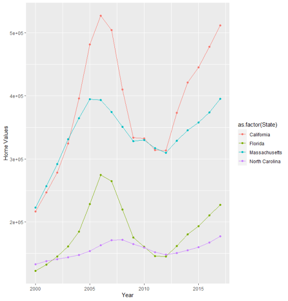
### % Subprime Borrowers in North Carolina (2005-2010)
```{r Subprime Borrowers in North Carolina}
ChartA <- ggplot(Subprime_NC, aes(x = `Year-Quarter`, y = Percent, color=`Percent`)) +
geom_point(size=3) +
geom_smooth(method="lm", se=FALSE) +
ylab("% Receiving Subprime Loans (NC)") +
theme(axis.text.x = element_text(angle = 90, vjust = 0.5, hjust=1 ,size = 8), axis.title.y=element_text(size=5)) +
scale_x_discrete(limit = c("2005 Q1","2005 Q2","2005 Q3","2005 Q4","2006 Q1","2006 Q2","2006 Q3","2006 Q4","2007 Q1","2007 Q2","2007 Q3","2007 Q4","2008 Q1","2008 Q2","2008 Q3","2008 Q5","2009 Q1","2009 Q2","2009 Q3","2009 Q4","2010 Q1"))
plot(ChartA)
```
### % subprime Borrower in Massachusetts (2005-2010)
```{r Subprime Borrowers in Massachusetts}
ChartA <- ggplot(Subprime_MA, aes(x = `Year-Quarter`, y = Percent, color=`Percent`)) +
geom_point(size=3) +
geom_smooth(method="lm", se=FALSE) +
ylab("% Receiving Subprime Loans (MA)") +
theme(axis.text.x = element_text(angle = 90, vjust = 0.5, hjust=1 ,size = 8), axis.title.y=element_text(size=5)) +
scale_x_discrete(limit = c("2005 Q1","2005 Q2","2005 Q3","2005 Q4","2006 Q1","2006 Q2","2006 Q3","2006 Q4","2007 Q1","2007 Q2","2007 Q3","2007 Q4","2008 Q1","2008 Q2","2008 Q3","2008 Q5","2009 Q1","2009 Q2","2009 Q3","2009 Q4","2010 Q1"))
plot(ChartA)
```
### % subprime Borrowers in Florida (2005-2010)
```{r Subprime Borrowers in California}
ChartA <- ggplot(Subprime_CA, aes(x = `Year-Quarter`, y = Percent, color=`Percent`)) +
geom_point(size=3) +
geom_smooth(method="lm", se=FALSE) +
ylab("% Receiving Subprime Loans (CA)") +
theme(axis.text.x = element_text(angle = 90, vjust = 0.5, hjust=1 ,size = 8), axis.title.y=element_text(size=5)) +
scale_x_discrete(limit = c("2005 Q1","2005 Q2","2005 Q3","2005 Q4","2006 Q1","2006 Q2","2006 Q3","2006 Q4","2007 Q1","2007 Q2","2007 Q3","2007 Q4","2008 Q1","2008 Q2","2008 Q3","2008 Q5","2009 Q1","2009 Q2","2009 Q3","2009 Q4","2010 Q1"))
plot(ChartA)
```
### % subprime Borrowers in California (2005-2010)
```{r Subprime Borrowers in Florida}
ChartA <- ggplot(Subprime_FL, aes(x = `Year-Quarter`, y = Percent, color=`Percent`)) +
geom_point(size=3) +
ylab("% Receiving Subprime Loans (FL)") +
theme(axis.text.x = element_text(angle = 90, vjust = 0.5, hjust=1 ,size = 8), axis.title.y=element_text(size=5)) +
scale_x_discrete(limit = c("2005 Q1","2005 Q2","2005 Q3","2005 Q4","2006 Q1","2006 Q2","2006 Q3","2006 Q4","2007 Q1","2007 Q2","2007 Q3","2007 Q4","2008 Q1","2008 Q2","2008 Q3","2008 Q5","2009 Q1","2009 Q2","2009 Q3","2009 Q4","2010 Q1"))
plot(ChartA)
```